What is your developer-dependent CMS actually costing you? Calculate your costs and get a full report


Editors
Working with Components
This guide explains how to work with components in Agility CMS. Components are reusable building blocks that display content on pages.
This guide explains how to work with components in Agility CMS. Components are reusable building blocks that display content on pages.
What Is a Component?
A Component is a reusable building block that displays content on a page. Think of components as LEGO blocks—you combine different components to build a complete page.
Component Structure
- Component Model: Defines what fields a component has
- Component Instance: An actual component placed on a page with data
- Content Zones: Where components are placed on pages
Component Models
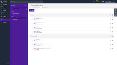
Component Models define the structure of components:
- What fields the component has
- Field types (text, image, linked content, etc.)
- Validation rules
- Default values
Adding Components to Pages
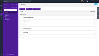
- Open the page you want to edit
- In the page editor, you'll see Content Zones (areas where components can be added)
- Click "Add Component" in the desired content zone
- Select the component type from the list
- Configure the component's content fields
- Click "Save"
Editing Components
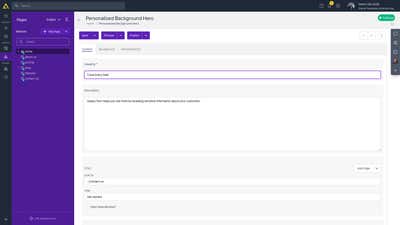
- Navigate to the page containing the component
- Click on the component in the page editor
- The component editor opens
- Make your changes to the component's fields
- Click "Save"
Linking Content to Components
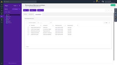
Many components can link to content items. This allows components to display reusable content.
How to Link Content
- Open the component editor
- Find the field that accepts linked content (often labeled with a link icon)
- Click to open the content picker
- Select the content item(s) you want to link
- Save the component
Example: A "Testimonials" component might link to multiple "Testimonial" content items to display them on the page.
Component Field Types
Components can have various field types:
- Text: Headings, descriptions, labels
- Rich Text: Formatted content
- Image: Images displayed by the component
- Linked Content: Link to content items
- Multiple Linked Content: Link to multiple content items
- Number: Numeric values for configuration
- Boolean: Toggle options
Component Placement
Components are placed in Content Zones on pages:
- Each page model defines available content zones
- You can add multiple components to each zone
- Components appear in the order they're added
Component Reusability
The same component can be used on multiple pages:
- Create a component once
- Use it on different pages
- Each instance can have different content
Best Practices
- Use appropriate components: Choose components that match your content needs
- Link to content items: Use linked content for reusable content
- Organize in zones: Place components logically in content zones
- Keep components focused: Each component should have a single, clear purpose
- Test components: Preview pages to see how components appear
Next: Workflow - Publishing workflow and approval processes
On this page